archive: review-problem solvers: Problem solvers, priests and pests
Impressions from David Carson, famed designer of letters tattered, toppled and tumbled
BY HANS KLEEFELD
“Don’t mistake legibility for communication” “You can’t not communicate.” If you’re familiar with these observations, you’ll know of David Carson, and you’ll know his work-for the magazines Ray Gun, Surfer and Beach Culture; for Armani and Quiksilver fashions; for Fox television. In Canada, Carson had a hand in the Bank of Montreal’s Fingerprint and the Leap Batteries campaigns.
If you’ve never encountered the man, pity. He’s got a laid-back sense of humour about what he does, and the graphic design profession generally, which goes a long way to defuse irritation that conservative type practitioners may feel towards Carson’s sometimes grating graphics. Anyway, he recently had and audience at the Design Exchange in Toronto laughing through most of his presentation.
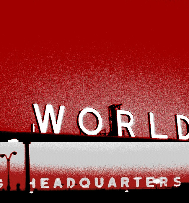
Some of the hilarity was triggered by slides of graffiti and inadvertently humorous random graphics that Carson apparently tracks down and records in search of inspiration. This, he suggests, is what designers should observe, rather than our over each other’s work in design magazines and annuals.
Particularly intriguing were several shots of torn posters revealing odd details of imagery from previous postings beneath. Accidental though such effects are, they nevertheless encourage viewers to find some meaning in them. David Carson is not the only one who seems thus “life-focused,” but maybe he is exploiting it more astutely than others.
If one were to put graphic designers into categories, there might be three: problem solvers, priests and pests.
Problem solvers make up the majority. Whether conservative or cool in their work, they quietly do their stuff for countless corporations’ causes. They’re the unsung heroes behind messages competently fashioned in a spirit once defined by Herb Lubalin, well-known NewYork type-whizin his day, as: The best typography never gets noticed.
Priests, then, are a select few individuals who a combination of circumstances has elevated to professional luminosity. Priests generally become what they are through irreverent work which many problem solvers wished they’d done, but didn’t have the nerve to generate and sell; and of course, through unabashed self-promotion. David Carson, like Britain’s Neville Brody and Canada’s Bruce Mau, is a member of that group, which seems to unfailingly inspire some while aggravating others.
Pests, finally, are hordes of desktop meddlers whose software prowess is surpassed only by their soft grasp of type and design basics-common sense rules that problem solvers follow conscientiously, and that priests like to break with cheerful vigor. Pests make up a murky mass, best ignored-if it weren’t for the dread prospect that pests may unwittingly take us one step closer to virtual design and Mclayouts.
Why do designers choose to not only bend, but break traditions? Are they shooting themselves in the foot? Or are they doing both for their clients and their clients’ audiences a valuable service?
Consider here Carson’s first-quoted statement: don’t mistake legibility for communication. Most problem solvers’ communication efforts are decidedly driven by legibility objectives-make brand names and product benefits clearer, bigger, bolder. Show and tell everything. That’s fine in theory and by itself. But what if all competitors, and a zillion other sellers do the same? Any chance that viewers may get bored out of their skulls by endless overkill? look around and you may notice a nation of scanners, who flip-flip-flip through pages or channels. For those living in a hurry, is legibility really a hot commodity?
Communication implies engagement. Marketing gurus endlessly acclaim emotional involvement as the road to consumers’ minds, hearts and wallets. What if it’s no longer possible to seriously engage with overplayed, tried-and-trusted formats? David Carson seems to suggest that you now have to be very different to be noticed and to penetrate viewers’ consciousness. That observation, at least, clearly has merit.
Carson’s second-quoted statement-you can’t not communicate-is equally provocative. At first glance, it seems to merely state the obvious. But what if it refers to what you don’t show or tell? What if absence of daring visuals signals lack of spirit; what if the obvious, no matter how well-designed in its own right, sends a message of conformity?
What wants to be read at length obviously should at least be fairly legible. Even Carson’s own Web site bio (at
www.davidcarsondesign.com) is straight lower case sans serif type without font mixes (though the lines are pretty long and packed close); but then the bulk of graphic deisgn communication, both in print or video, operates more and more in sight-and soundbite fashion, anyway. Here David Carson’s ground-breaking kaleidoscopic, visually pulsating imagery presents, if not a standard, then at least a reference that may well inspire others to search for new ways to put messages across.
HANS KLEEFELD is a creative director at Watt International in Toronto.


